- Packages I will use to read in and plot the data
- Read the data in from part 1
Interactive graph
- Start with the data
- Group_by digital media so there will be a “river” for each digital media
- Use e_charts to create an e_charts object with Year on the x axis
- Use e-river to build “rivers” that contain daily hours spent by each device. The depth of each river represents the amount of daily hours spent for each device
- Use e_tooltip to add a tooltip that will display based on the axis values
- Use e_title to add a title, subtitle, and link to subtitle
- Use e_theme to change the theme to roma
daily_hours_spent %>%
  group_by(`Mobile (BOND Internet Trends (2019))`, `Desktop/Laptop (BOND Internet Trends (2019))`, `Other Connected Devices (BOND Internet Trends (2019))`) %>%
  e_charts(x = Year) %>%
  e_river(serie = `Mobile (BOND Internet Trends (2019))`, legend = FALSE) %>%
  e_tooltip(trigger = "axis") %>%
  e_title(text = "Daily hours spent with digital media",
          subtext = "Source: Our World in Data",
          sublink = "https://ourworldindata.org/grapher/daily-hours-spent-with-digital-media-per-adult-user?country=~USA",
          left = "center") %>%
  e_theme("roma")
Static Graph
- Start with the data
- Use ggplot to create a new ggplot object. Use aes to indicated that Year will be mapped to the x axis; Daily hours spent will be mapped to the y axis; Digital Media will be the fill variable
- geom_area will display Daily hours spent
- scale_fill_discrete_divergingx is a function in the colorspace package. It sets the color palette to roma and selects a maximum of 12 colors for the different regions
- theme_classic sets the the theme
- theme(legend.position = “bottom”) puts the legend at the bottom of the plot -labs sets the y axis label, fill = NULL indicates that the fill variable will have the labelled Digital Media
daily_hours_spent %>%
  ggplot(aes(x = Year, y = `Mobile (BOND Internet Trends (2019))`, `Desktop/Laptop (BOND Internet Trends (2019))`, `Other Connected Devices (BOND Internet Trends (2019))`, fill = Code)) +
  geom_area() +
  colorspace::scale_fill_discrete_divergingx(palette = "roma", nmax = 3) +
  theme_classic() +
  theme(legend.position = "bottom") +
  labs(y =  "Daily hours spent",
       fill = NULL)
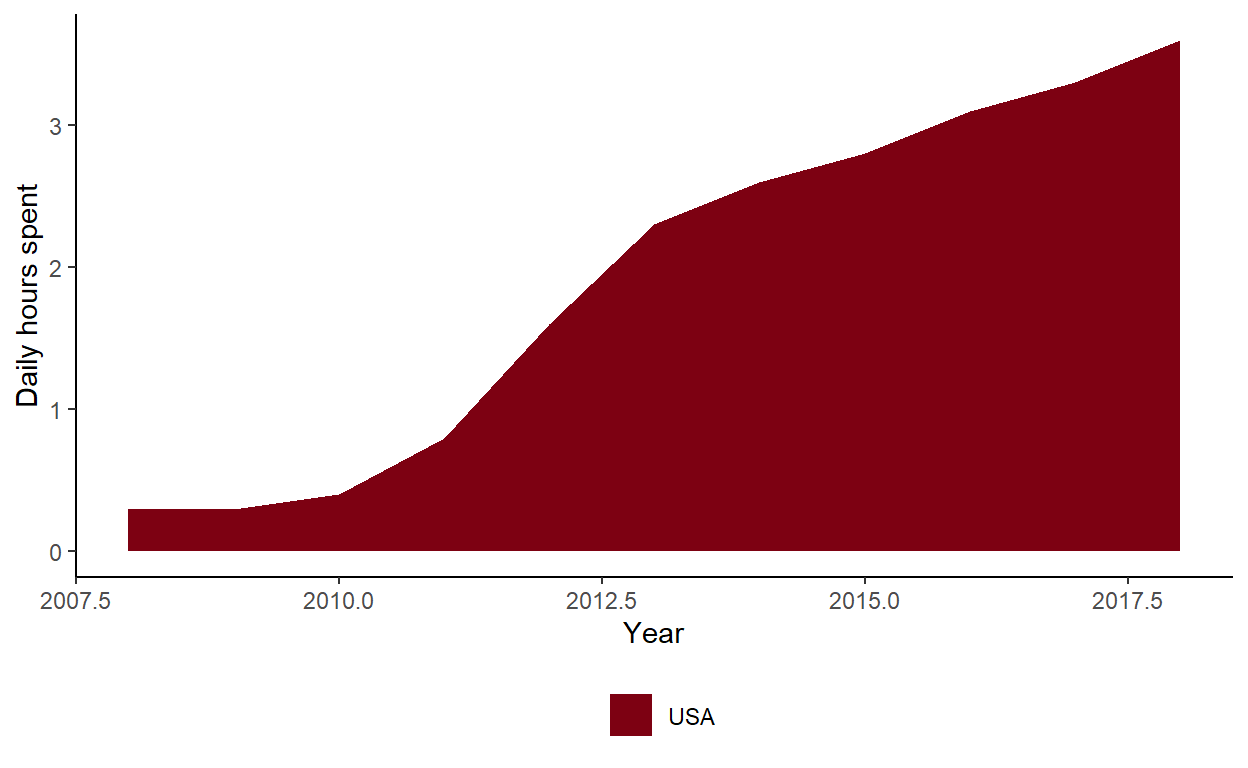
These plots show a steady increase in daily hours spent with digital media since 2008. Daily hours spent have continued to increase.